Email Design Quick Wins
Bex Osborn
Marketing Strategist
17 Oct 2022
Making your brand identity work within the context of email can be hard work. Not quite adhering to the design principals of a webpage, app or even a physical letter, email design exists as its own unique medium.
It’s easy to get lost in all the small details, so we’re taking a step back to focus on some of the fundamentals that are easy to achieve. Quick wins if you will, and everyone loves those, right?
Big differences with minimal effort = yes please. Let’s begin!

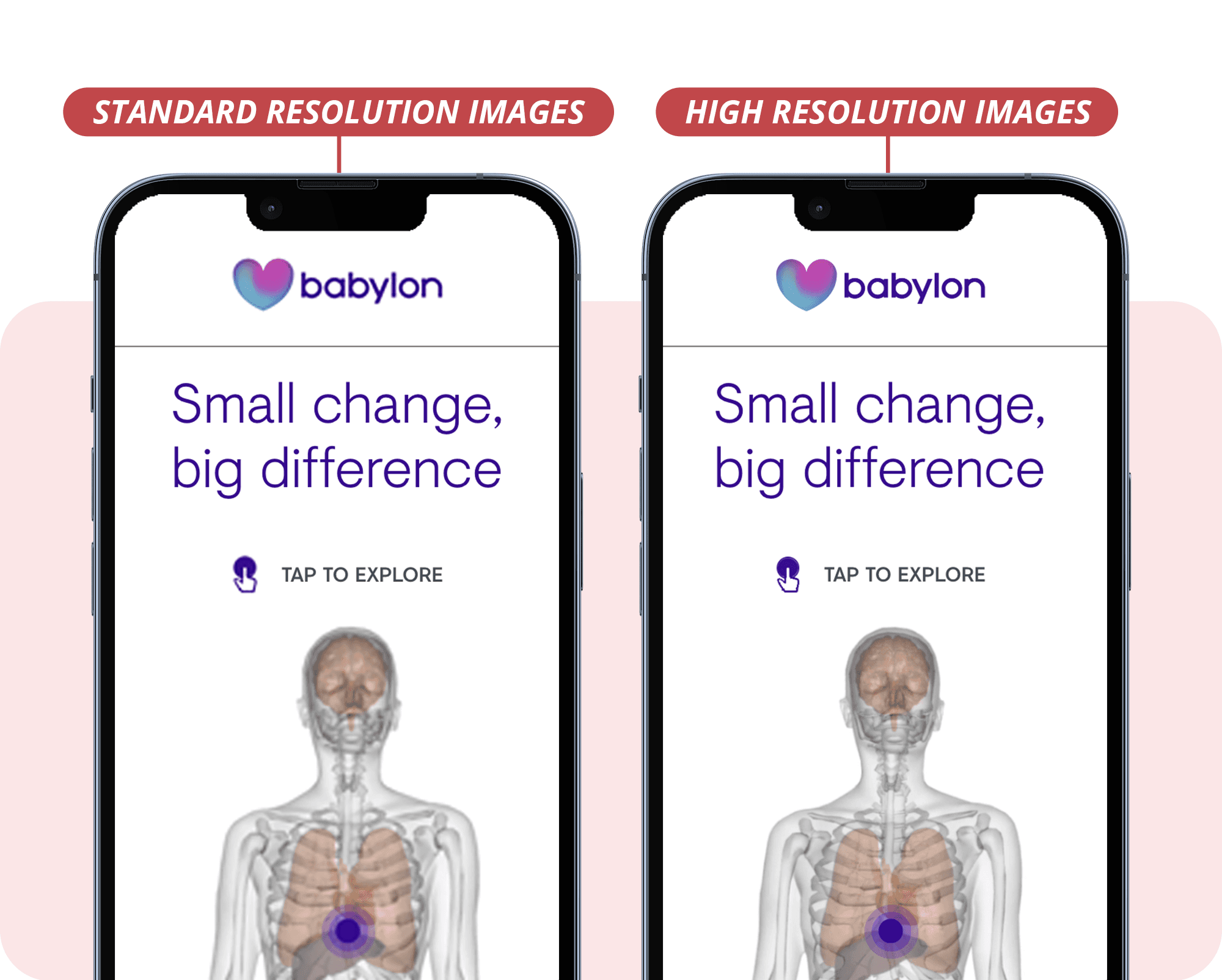
It’s most apparent in small images containing text, such as the logos above in the simulated image - note this difference is far more pronounced on a real phone.
Use high-resolution images to achieve a premium look
We’ve been living in a world of high resolution devices for a while now, starting off with the iPhone 4 and now on pretty much every mobile device going. Not only that, but the desktops and laptops we use every day are catching up too.
They provide us with pin-sharp text and super-detailed imagery - but at a cost. We need to supply them with images that have at least double their previous resolution - failure to so to means blurry images and smudged logos. This has the effect of making your designs look unprofessional, low quality and, depending on your industry, even fraudulent.
The Quick Win
Thankfully, there’s an easy solution, just make sure your images are supplied at double their specified size in your code. For instance, the space in your design for 50x50 pixel logo would need to be filled with a 100x100 pixel version of it. It’ll still take up the same amount of space on the screen, but that extra image data will make it look pin-sharp and professional.

Bring designs to life with custom fonts and Google Fonts
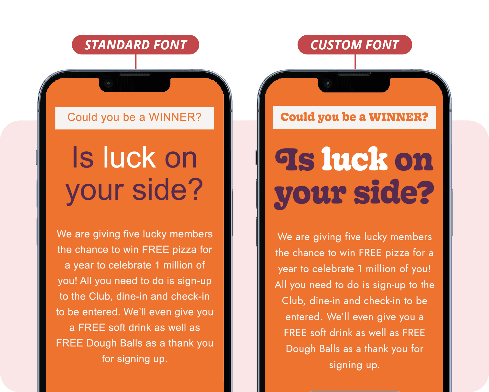
One of the easiest ways to bring some unique character to your designs is adding in a customised font.
Achieving this can be a bit of a technical bore (Setting up font licensing, font hosting, CORS, etc… 😴) but thankfully the excellent Google Fonts can solve much of the headaches caused when using a custom font.
Your font will still fall back to a web-safe font, such as Arial, where Google Fonts are not supported (including, curiously, Google’s own Gmail 👀). But in the many places where they are supported, your design will gain the extra character and depth that only a finely matched font can provide.
The Quick Win
Web Fonts: How to Make Them Work Perfectly in Email (Litmus).

Avoid rigid layouts by introducing asymmetry
The majority of emails are designed around an old aspect of HTML code called Tables. And when I say Tables, I literally mean the same kind of tables you use in Excel, Word or a Google Doc. Yes, I know….
Anyway, the outlines of these tables are usually invisible, but the cells and rows within them hold the images, text and buttons of an email.
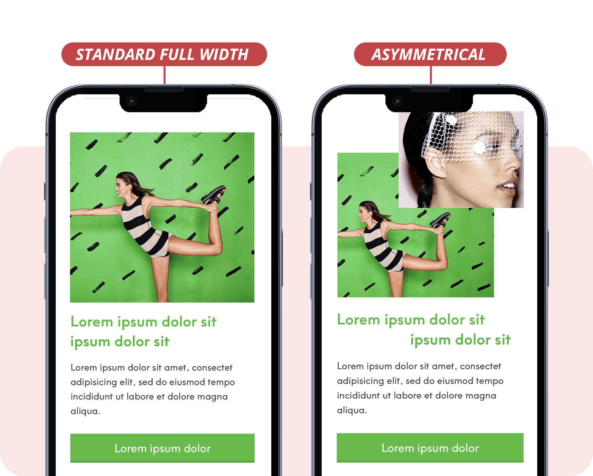
A downside of tables is that they naturally look, well, like tables. Very boxy, boring and over-familiar - which can lead to your design looking a bit tired.
The Quick Win
A great way to use this to your advantage is to ‘break the grid’ and design against the uniform rigidity of a table - making your design look more organic, flowy and eye-catching.

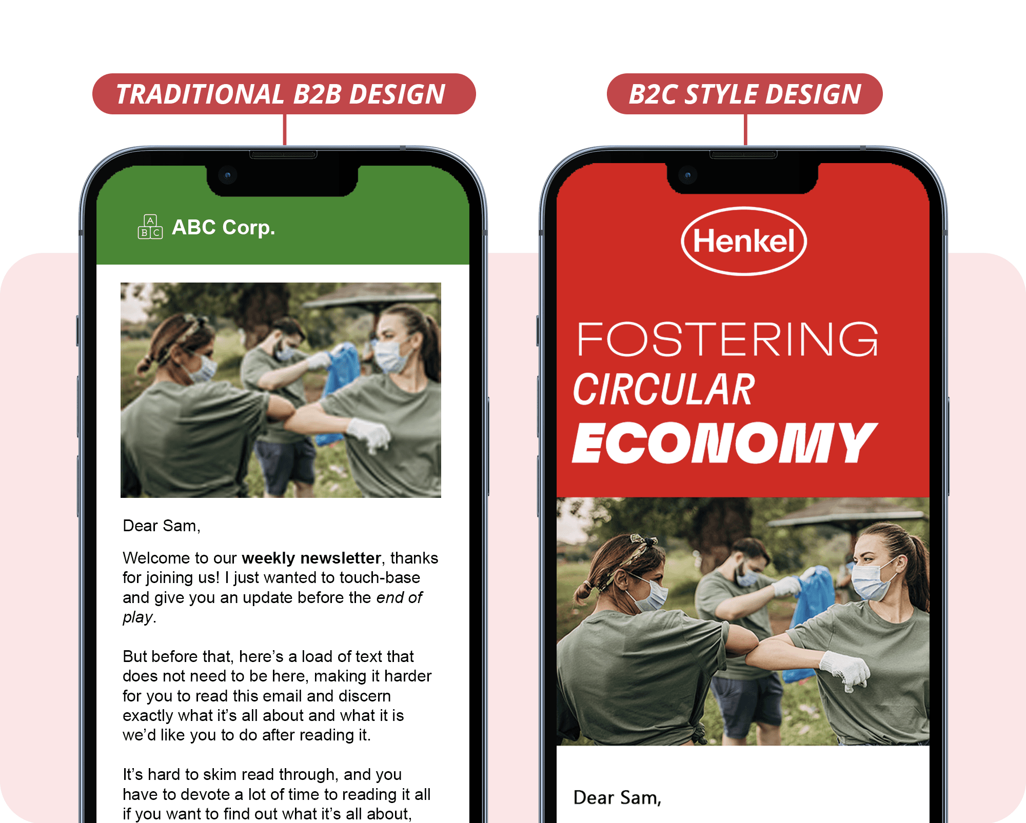
I’m not sure how it happened, but back when businesses started marketing to other businesses, they seemed to forget that the people they were marketing to were not business robots, but are in-fact, other people just like them 🤯
The result of this is overstuffed, super-heavy, primitive designs that contain every bit of information they can. Overly long copy, poor quality imagery, cramped design and other elements that make the overall experience a miserable and less effective one.
The Quick Win
So when designing for other businesses, remember, the people reading your messages are just like you. They will respond far better to a beautiful, considered, simple design that grabs their attention - and not overstuffed word-soup filled with business jargon. Really Good Emails is a great place to start getting inspiration for you next design.