Fin Baker
CRM Designer
9 Sept 2024
Despite their simple designs, Patagonia’s emails are easily the thing that I’m most excited to see pop up in my inbox each week. There are no flashy animations, interactive modules or magic personalisation, but what keeps me coming back for more is how their cause-first, product-second approach is reflected so effortlessly in their designs. You know an email’s doing something right when it’s got you thinking about fly fishing…without even liking fish.
Let’s take a closer look at the basic yet effective design choices that make Patagonia my favourite inbox regular.
A scene-setting opener
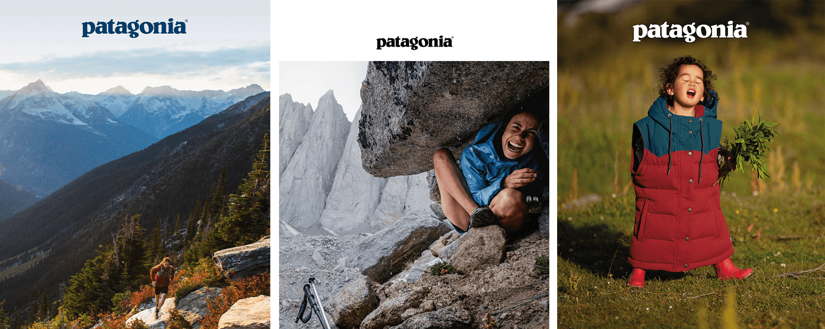
Ask any email designer and it’s a safe bet that they’ll tell you it’s good practice to keep your title and CTA visible above the fold, ensuring there’s no digging needed to see the primary message. Patagonia takes a different approach however, leading instead with large, scene-setting imagery that sparks the email’s narrative and never fails to get me scrolling.
I’ll be the first to admit that I’m a sucker for a big hero image paired with some thematic title treatment, but it’s hard to forgo the accessibility and reliability of web text. In a world of split-second attention spans however, I’d say opening with a powerful shot of your product in-situ is worth the risk, especially considering the nature of Patagonia’s adventure-motivated audience.

Intertwining purpose and products
Compared to most retail brands, Patagonia’s emails rarely make me feel like I’m scrolling through a catalogue of products. This is partly due to the send frequency (once or twice a fortnight) but largely due to the fact that their gear takes a back seat in favour of community spotlights, customer quotes and links to articles and environmental missions.
Where products are featured, Patagonia keeps it simple, sometimes communicating key features but often just using simple imagery (sometimes not even names!). This is rare for retailers but perfect for Patagonia’s marketing ethos. The same is reflected across their social media, exchanging the usual retail marketing buzzwords for community stories, giving social proof as to why their customers love their products.
Bite-sized blocks
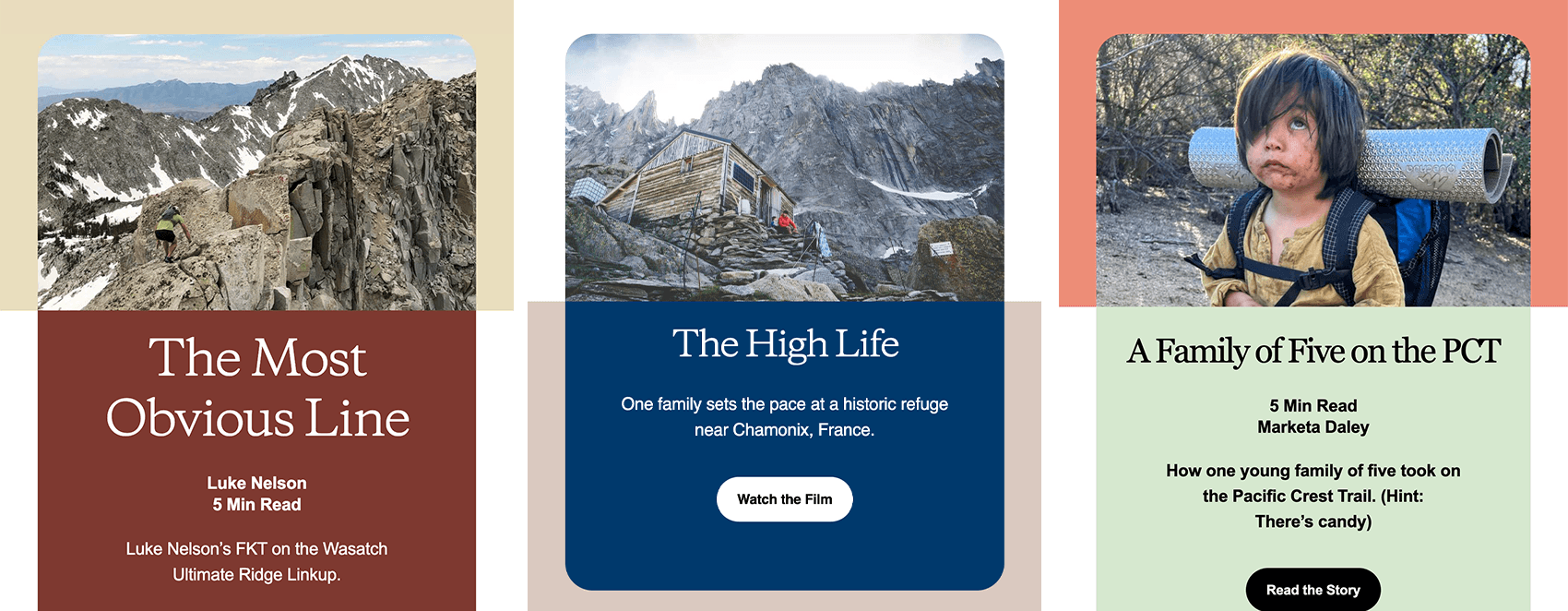
When designing, it’s easy to look at and see an email as one big picture, but it’s important to remember that recipients only view the small portion that fits on their screen at one time. From a layout perspective this might seem like pretty basic stuff, but blocks that parcel out information into bite-sized chunks whilst still tying the content together always get a gold star from me.
Though there’s room for improvement when it comes to how Patagonia displays their content on varying screen sizes, their layout approach perfectly compliments their successfully intertwined balance of purpose and product.

Bookending the email
If there’s one thing a Patagonia email is guaranteed to have, it’s a consistent theme. After starting with a scene-setting hero and content that combines product and mission, Patagonia signs off each email with a video or article that fits the email’s topic, bookending the cause-first approach.
A simple touch but I love how Patagonia doesn’t end with one last marketing push towards their products but instead offers an opportunity for readers to continue learning about this email’s choice of mission topic.
It’s clear that whilst there are some opportunities to raise their email game even more, Patagonia very much understands how to nail the basics. Their audience’s needs and drive for purpose is reflected in every bit of content that they send out and it’s no wonder they’ve become a leader for both quality products and environmental causes.

Does your brand need some help climbing the CRM mountain? Drop us a message here, to discuss how our specialist team of CRM strategists and brand, design, copy and code experts can help.
