Top Designs for March
Scarlett Soodhoo
Copywriter
31 Mar 2025
We made it to March and that means spring is just around the corner – eek! This month, we saw a flurry of green in our inboxes as brands celebrated St Patrick’s Day and World Book Day even made a wholesome appearance. It was a hard one to narrow down but someone’s got to do it so check out a few of our favourites below!
1. McDonald's
SL: Minty, creamy, deliciously dreamy 🍃🥤
Chosen for: Theme
The McDonald’s Shamrock Shake is coming to the UK for the first time ever! It’s a pretty big deal and this email conveys just that. The colours are bold, the animation is smooth and the design is almost psychedelic. As for messaging, the shake is minty, creamy and deliciously dreamy. I can order it now and participating restaurants are donating 20p from every sale of it to charity - what more do I need to know?

2. Lick
SL: The sun is shining ☀️
Chosen for: Copy
If you can make room for reactive marketing in your prepped and planned campaign calendar, then you’re onto a winner. This email from Lick is a great example of that, playing into the streak of joyful sunshine seen by the UK this week. Opening with an always-pleasing alliterated title, the email is packed with tips for brightening rooms of any shape or size. The sun puts smiles on faces, so helping people make the most of natural light in their homes is a genius example of how marketing can be emotional and educational at the same time.

3. Ancient & Brave
SL: Is your lifestyle affecting your collagen?
Chosen for: Storytelling
Collagen. Should I be taking it? If so, what type should I be taking? I’m sure I’m not alone when I say that it’s a bit of a minefield. Luckily for its subscribers, this email from Ancient & Brave is full of tips on how to support collagen production. These tips are displayed in a clean and concise manner using icons and streamlined copy that lead smoothly into product recommendations and even a handy quiz! It’s one of those emails you’ll definitely go back to or forward to friends, and that is always a good sign.

4. Daisy London
SL: FEELING LUCKY?
Chosen for: Theme
This quirky email teases the collaboration between jewellery brands Shrimps and Daisy. The clean and classy GIF really steals the show and with subtle elements like the four leaf clovers, green colour palette and messaging of ‘Will you be the lucky one?’, the St Patrick’s Day theme shines through without ever actually being mentioned. The copy under the GIF is as short and sweet as it gets – the new compact case is coming and your jewellery deserves it! I’m sold.

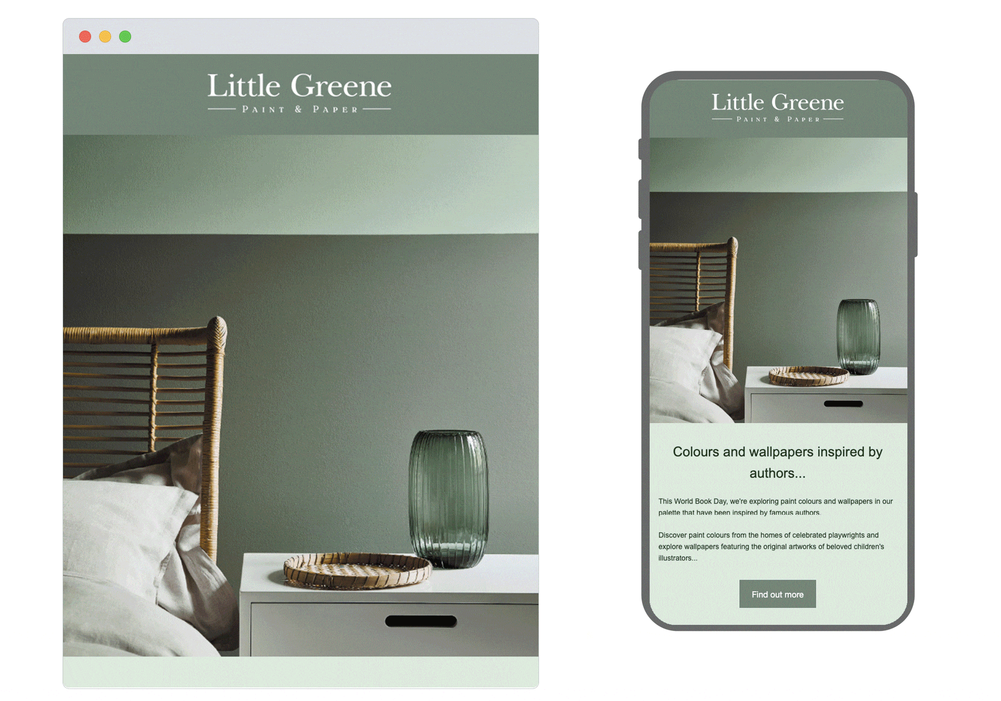
5.Little Greene
SL: Colours and wallpapers inspired by authors...
Chosen for: Visual storytelling
World Book Day isn’t just for kids and this email from Little Green proves just that! With an inviting combination of greens, earthy tones and simple block modules, readers can scroll through a visual journey of paints and wallpapers, inspired by famous authors. Subtly weaving occasions into your marketing calendar can be difficult, but just like the works of those celebrated on World Book Day, each Little Greene product tells its own story. This makes the whole connection feel organic and book lover or not, how fun to choose a wallpaper inspired by Rudyard Kipling?
Seen anything you like? Our team of specialist strategists, coders, copywriters and designers would be happy to help you take your email game to the next level. Get in touch to find out how!